Presentation Building
 |
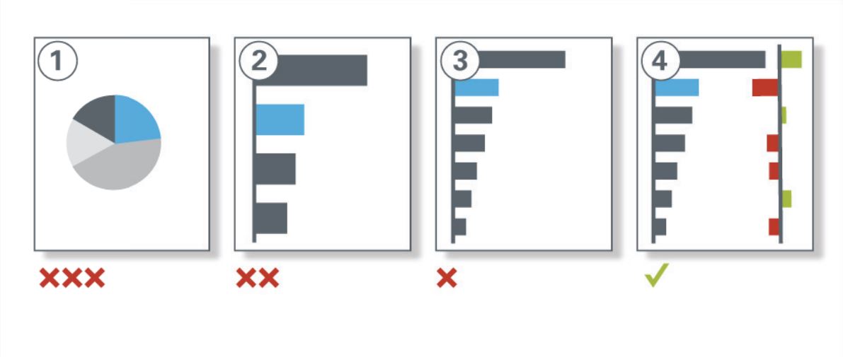
| Use more meaningful visualization |
 |
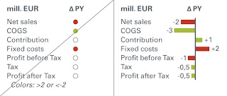
| Integrate explanations into charts |
 |
| Link explanations to the table content |
 |
| Name sources and definitions |
 |
| Show small multiples |
 |
| Show more elements |
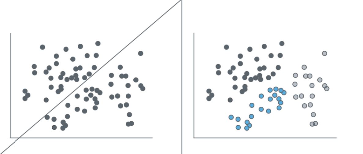 |
| Show clusters |
 |
| Show correlations |
 |
| Use normalized data: inflation and currency adjusted |
 |
| Use small multiples instead of spaghetti charts |
 |
| Use scaling bars to allow different scales |
 |
| Use creative charts to compare extreme values |
 |
| Present alternatives, let auditorium decide |
 |
| Reduce complexity to their essentails with a hugh density |
 |
| Avoid lines, marks, and value axes without meaning |
 |
| Avoid colors without meaning |
 |
| Avoid colored or structured backgrounds without meaning |
 |
| Avoid gridlines in tables without meaning |
 |
| Simplify elaborate visuals |
 |
| Omid long numbers: use 3 digits in charts and talkes |
 |
| Avoid unnecessary labels |
 |
| Build exhaustive structures in charts |
 |
| Show structures in notes |
Quelle: Hichert Partner