Posts

Es werden Posts vom Juli, 2013 angezeigt.

Das gesprochene Wort zählt!?

Nach meiner Beobachtung zählt das gesprochene Wort heute immer weniger, im Wirtschaftsleben.

M2M: The Internet of Things

Bild

Investors of Tesla Motors

Bild
Bildunterschrift hinzufügen

The top 20 data visualisation tools

Bild
The top 20 data visualisation tools From simple charts to complex maps and infographics, Brian Suda's round-up of the best – and mostly free – tools has everything you need to bring your data to life One of the most common questions I get asked is how to get started with data visualisations. Beyond following blogs, you need to practise – and to practise, you need to understand the tools available. In this article, I want to introduce you to 20 different tools for creating visualisations: from simple charts to complex graphs, maps and infographics. Almost everything here is available for free, and some you have probably installed already. Entry-level tools At the entry level, we'll be looking at unexpected uses for familiar tools. You might not think of Excel as a visualisation package, for example – but it's capable of surprisingly complex results. If you are just getting started, these tools are musts to understand. If you deal with visualisations ever...
Bischöfe, verlasst die Kirchen!

Papst Franziskus (76)  hat den katholischen Klerus aufgefordert, sich stärker um die Armen und Bedürftigen zu kümmern. Dazu müssten Bischöfe, Priester und Nonnen ihre Komfortzonen verlassen und die Menschen auch auf den Straßen und in den Elendsvierteln besuchen, sagte der Papst am Samstag bei einer Messe in Rio de Janeiro.

2005: Schröder vs. Merkel - die historische Elefantenrunde direkt nach der Wahl

Bild
Quelle: YouTube.com

Presentation Building

Bild
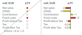
Use more meaningful visualization Integrate explanations into charts Link explanations to the table content Name sources and definitions Show small multiples Show more elements Show clusters Show correlations Use normalized data: inflation and currency adjusted Use small multiples instead of spaghetti charts Use scaling bars to allow different scales Use creative charts to compare extreme values Present alternatives, let auditorium decide Reduce complexity to their essentails with a hugh density Avoid lines, marks, and value axes without meaning Avoid colors without meaning Avoid colored or structured backgrounds without meaning Avoid gridlines in tables without meaning Simplify elaborate visuals O...